
[Ed. Note: The following analysis is by DCPS parent Betsy Wolf. In her professional employment, Wolf conducts independent evaluations in education. While she cautions that she is not an expert in educational assessments such as PARCC, she routinely uses such assessments in her work. We are lucky to have here her observations of the last two years of PARCC data in DC’s publicly funded schools, as no one else in DC appears to be looking at our data in quite the same way.]
By Betsy Wolf
As many of us in DC know very well, PARCC is a standardized test administered each spring to DC’s public school students in grades 3–8 and in various high school grades.
The tests are scored on five levels:
1: Did not yet meet expectations
2: Partially met expectations
3: Approached expectations
4: Met expectations
5: Exceeded expectations
Most people care about the percentage of students meeting PARCC levels 4 and 5, which is considered the benchmark for college and career readiness.
As recently revealed, DC’s public school PARCC scores saw a slight increase overall last school year for the third year in a row. That said, the majority of DC’s public school students still score below levels 4 and 5.
To figure out what these annual increases mean, I sought to answer a simple question: Has student performance actually improved or is the increase in test scores a result of a shift in student demographics, as test scores are closely correlated with household income?
Unfortunately, we cannot really say precisely one way or another, because we don’t have access to student-level data. That is, we don’t know exactly how much individual students gained; which student subgroups gained; why students did (or did not) gain; and in which schools individual students had the greatest gains.
That said, if we compare data aggregated at the school level from the 2016–17 and 2017–18 school years, we can observe how increases in the percentages of students who scored at levels 4 or 5 were (or were not) related to changes in the percentage of test takers who were at risk at each school.
To be sure, there are many variables to account for, and here I accounted only for changes in the percentage of at risk students taking the PARCC tests. In DC, where student achievement is related to household income, “at risk” provides a convenient way to identify students with the fewest resources, as our office of the state superintendent of education (OSSE) disaggregates student achievement data for at risk students. Per DC code, “at risk” designates a student who qualifies for Temporary Assistance for Needy Families (TANF) or the Supplemental Nutrition Assistance Program (SNAP); and/or is homeless or in the foster care system; and/or is a high school student who is older than the expected age for his/her grade.
Before we dive into my graphs (and my conclusions in boldface) below, I wanted to note some limitations in my analysis. First, OSSE lists “n<10” if there are fewer than 10 at risk PARCC takers; I coded these as 0, but at the very most, a school could have 9 at risk PARCC takers instead of none. Second, I chose to look at percentages in terms of raw numbers, as it is convenient and relatively accurate–but percentages can move around wildly when sample sizes are small. Third, when controlling for changes in student demographics, I controlled for only change in percentage at risk, but there are many other variables that could be important, such as change in proportion of English learners. Finally, analyzing gains in students scoring at PARCC levels 4 and 5 has some distinct limitations. For one, schools with very high proportions of students already achieving at those levels don’t have much room to grow. And schools where more than 75% of kids scored at levels 4 and 5 in both math and reading were schools that served less than 10 at risk PARCC takers each.
As you can see from the graphs below, some of the growth in PARCC scores, particularly in DCPS, coincided with a reduction in the percentage of PARCC takers who were at risk.
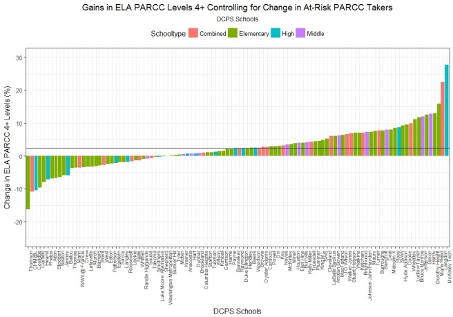
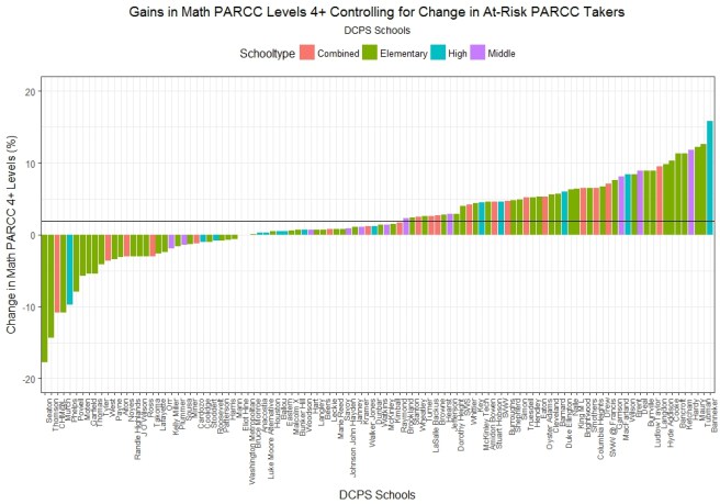
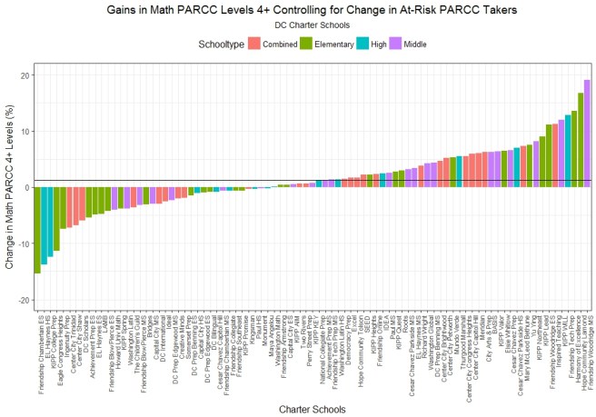
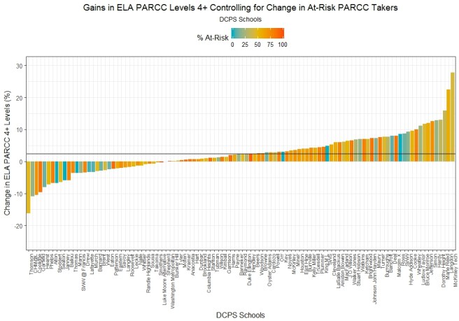
The x-axis in the following graphs is the percentage point change in numbers of students taking PARCC who are also described as at risk. A positive value indicates that the proportion of PARCC takers who were at risk increased from one year to the next, while a negative value indicates a decrease. The y-axis shows the percentage point change in the percentage of students who scored at levels 4 or 5, with math and English language arts (ELA) results combined.
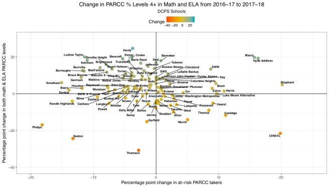
Copyright Betsy Wolf, 2018
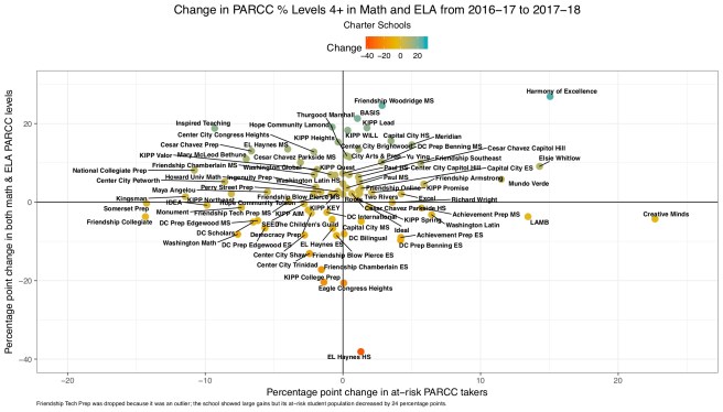
Copyright Betsy Wolf, 2018
Analyzing results at PARCC levels 4 and 5 is problematic because those levels represent relatively high bars and do not capture growth shown at other levels (i.e., students going from level 1 to level 3). Because of this, I also looked at changes in the percentages of students who scored at levels 3-5 on PARCC from one year to the next. These graphs show similar trends as the previous ones, with some DCPS schools showing exceptionally good growth from level 3 on up.
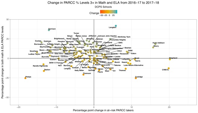
Copyright Betsy Wolf, 2018
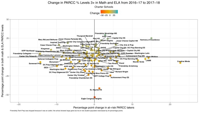
Copyright Betsy Wolf, 2018
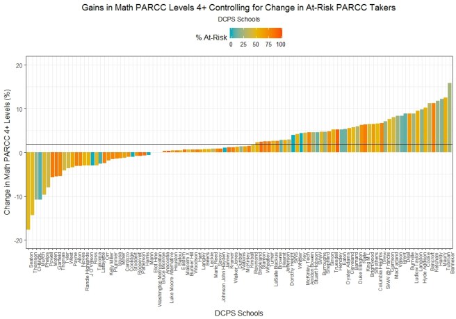
To answer the basic question of which schools saw the highest gains, while controlling for the change in at risk populations, I ran a regression model predicting change in the percentage of students scoring at levels 4 and 5, while controlling for change in at risk PARCC takers from the 2016–17 to 2017–18 school year. This analysis tells us how each school fared in terms of increasing the percentage of students who scored at levels 4 and 5, while controlling for demographic changes in student population. Such a regression model removes any variation in the y-variable due to variation in the x-variable, and thus removes any variation due to changes in the proportion of at risk students.
In the following graphs, a positive y-value indicates a gain, and a negative value indicates a loss, controlling for changes in at risk student percentages. The schools are placed on the x-axis from left to right in the order of their losses or gains on test scores. The graphs are disaggregated for math and ELA scores and for DCPS and charters.
Looking at these distributions by school type (e.g., elementary, middle, high, combined), we see that the number of schools that saw gains in test scores was greater than the number of schools that saw losses. The horizontal lines are the sector averages for growth, controlling for change in at risk populations at each. In this analysis, DCPS has slightly higher growth in test scores than charters.
Copyright Betsy Wolf, 2018
Copyright Betsy Wolf, 2018

Copyright Betsy Wolf, 2018
Copyright Betsy Wolf, 2018
One of the PR storylines about this year’s PARCC scores was that middle schools showed tremendous growth. While that is true in some cases (and at the means), not all middle schools saw gains. In fact, when you look at these graphs above, I’m not sure you would take away that middle schools stood out.
We can also look at the same distributions, but instead look for patterns in gains and school percent at risk. In that analysis, nothing stood out for me.
Copyright Betsy Wolf, 2018
Copyright Betsy Wolf, 2018

Copyright Betsy Wolf, 2018

Copyright Betsy Wolf, 2018
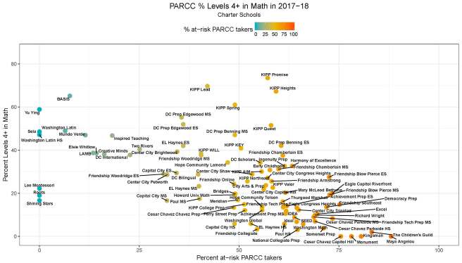
So, how many kids at each school scored a level 4 or 5 on PARCC? Here you go, immediately below. Only results for math are presented; ELA results are similar. The percentage of students who score at level 4 or 5 on the PARCC is correlated with the proportion of at risk students at each school. In other words, poverty affects achievement as shown by test scores.

Copyright Betsy Wolf, 2018
Copyright Betsy Wolf, 2018
The differences in these graphs highlight my concern with OSSE’s new 5-star rating of all our schools, to the extent that the percentage of students scoring at level 4 or 5 will affect a school’s rating. Because test scores are closely tied to socioeconomic status of students, schools will be judged on which students they serve–as opposed to valid measures of school quality or what schools are actually doing to help all students learn.
To better illuminate those last two things, I analyzed which schools had at risk students with 4 or 5 PARCC scores. When I looked at performance for at risk kids only, I still saw a negative relationship between at risk student performance and percentage at risk in the school–but it’s not as strong as in the prior graphs. Generally speaking, some schools with less than 75% concentrations of at risk students seem to have the most potential for helping at risk kids score at the highest levels of PARCC.

Copyright Betsy Wolf, 2018

Copyright Betsy Wolf, 2018
This goes into another PR line for these test scores: Although most schools serving very high concentrations of at risk students are DCPS schools, the charter board released (a few hours ahead of the most recent PARCC reveal) a statement saying that they serve a larger share of at risk kids than DCPS (48% versus DCPS’s 45%). So, what does this mean for test scores?
DCPS serves more at risk students than DC’s charter schools because DCPS serves more students overall. But while there are only a few charter schools serving predominantly at risk kids, there are many DCPS schools serving predominantly at risk kids, which means that DCPS is more likely to have schools on the extremes (i.e., with very few at risk kids or with student populations more than 75% at risk). As we saw above, schools with high concentrations of at risk students tend to have less potential to help those students score at the highest levels of PARCC.
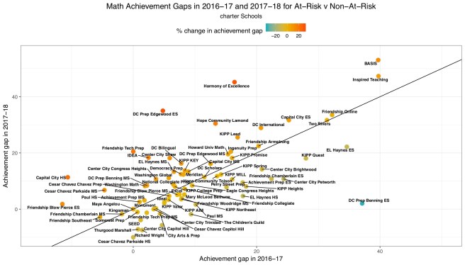
Related to this is how well schools are closing the achievement gap between at risk and non-at risk kids within their own schools. Schools above the diagonal line increased their achievement gap from 2016–17 to 2017–18, and schools below the line decreased their achievement gap.

Copyright Betsy Wolf, 2018

Copyright Betsy Wolf, 2018

Copyright Betsy Wolf, 2018
Copyright Betsy Wolf, 2018
While most public schools in DC in the last school year saw gains in test scores, those increases were fairly small–especially so, as we saw above, when you factor in the change in percentage of at risk students at each school. Another question thus needs addressing: are these gains a sign of true student learning or an artifact of 4 years of PARCC administration in DC, such that schools are better prepared for what is expected on that test?
It’s not clear anyone has an answer to that question–although it does appear that some schools really did make good gains this year. If my graphs show anything, it’s that there is high variability in how one can interpret these test scores. Thus, one needs to consider many factors in thinking about how our schools perform–way beyond merely displaying what percentage of students scored at the highest levels of PARCC at each school.
Imagine for moment how different this analysis could be if our education agencies would analyze student-level data and report on their findings. That is,
–What percentage of students gained over time?
–What were the average gains in terms of points on the test scale?
–Which student subgroups showed average gains or losses?
–What percentage of students moved from level 1 to 2, level 2 to 3, or level 1 to 3, etc.?
There are no shortage of research questions and implications for findings for education agencies truly interested in continuous improvement. Let us hope our DC education agencies embrace that challenge.

Very detailed and thorough – more than i could actually digest at one sitting!
I tried to extract what I thought were some of the salient points here at my blog, which you can find here: https://gfbrandenburg.wordpress.com/2018/08/28/a-thorough-analysis-of-dcs-parcc-scores/
LikeLike